This tutorial outlines the various attributes available for the HTML <input> element.
The value Attribute
The value attribute of the input specifies an initial value for the input field.
<form>
  <label for="fname">First name:</label><br>
  <input type="text" id="fname" name="fname" value="John"><br>
  <label for="lname">Last name:</label><br>
  <input type="text" id="lname" name="lname" value="Doe">
</form> 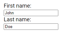
The readonly Attribute
The readonly attribute in HTML specifies that an input field is read-only.
This means that the field cannot be modified by the user, but they can still interact with it by tabbing to it, highlighting its contents, and copying text from it.
When the form containing a read-only input field is submitted, the value of the read-only field will be included in the form data.
 <form>
 <label for="fname">First name:</label><br>
 <input type="text" id="fname" name="fname" value="John" readonly><br>
 <label for="lname">Last name:</label><br>
 <input type="text" id="lname" name="lname" value="Doe">
</form> 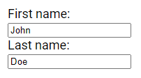
The disabled Attribute
The disabled attribute in HTML specifies that an input field should be disabled.
A disabled input field is unusable and unclickable, meaning users cannot interact with it. Importantly, the value of a disabled input field will not be sent when the form containing it is submitted.
<form>
     <label for="fname">First name:</label><br>
     <input type="text" id="fname" name="fname" value="John" disabled><br>
     <label for="lname">Last name:</label><br>
     <input type="text" id="lname" name="lname" value="Doe">
</form> 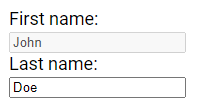
The size Attribute
The size attribute in HTML specifies the visible width, in characters, of an input field.
By default, the size is set to 20 characters.
Note: The size attribute works with the following input types: text, search, tel, url, email and password.
<form>
  <label for="fname">Name:</label><br>
  <input type="text" id="fname" name="fname" size="20"><br>
  <label for="code">Code:</label><br>
  <input type="text" id="code" name="code" size="10">
</form> 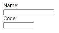
The maxlength Attribute
The maxlength attribute in HTML specifies the maximum number of characters allowed in an input field.
When maxlength is set, the input field will not accept more than the specified number of characters.
Note: The maxlength attribute does not provide any visual feedback to the user. If you want to alert the user about the character limit, you must write JavaScript code to handle this behavior.
<form>
  <label for="name">Name:</label><br>
  <input type="text" id="name" name="name" size="20"><br>
  <label for="code">code:</label><br>
  <input type="text" id="code" name="code" maxlength="6" size="10">
</form>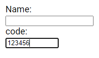
The min and max Attributes
The min and max attributes in HTML specify the minimum and maximum values allowed for an input field.
These attributes are typically used with input types such as number, range, date, datetime-local, month, time and week.
Note: You can use the min and max attributes together to create a range of legal values for the input field.
<form>
  <label for="datemax">Date before:</label>
  <input type="date" id="datemax" name="datemax" max="1996-12-31">  <br><br>
  <label for="datemin">Date after:</label>
  <input type="date" id="datemin" name="datemin" min="2004-01-02">
</form> 
The multiple Attribute
The multiple attribute in HTML specifies that the user is allowed to enter more than one value in an input field. This attribute is commonly used with the email and file input types.
<label for="colors" >Color:</label>
<select id="colors" name="colors" size="4" multiple >
  <option value="white">white</option>
  <option value="green">green</option>
  <option value="blue">blue</option>
  <option value="red">red</option>
</select> 
The pattern Attribute
The pattern attribute in HTML specifies a regular expression that the input field's value is checked against when the form is submitted.
This attribute is commonly used with input types such as text, date, search, url, tel, email and password.
Note: You can use the global title attribute to describe the pattern to help the user understand the expected input format.
<form>
  <label for="phone">Phone Number:</label>
  <input type="tel" id="phone" name="phone" pattern="[0-9]{2}-[0-9]{3}-[0-9]{7}" title="Allowed format: 12-123-1234567">
</form> 
The placeholder Attribute
The placeholder attribute in HTML provides a short hint that describes the expected value of an input field, such as a sample value or a brief description of the expected format.
This hint is displayed in the input field before the user enters a value.
The placeholder attribute is compatible with input types including text, search, url, number, tel, email and password.
<form>
  <label for="name">Name:</label>
  <input type="text" id="name" name="name"placeholder="Enter Full Name">
</form>![]()
The required Attribute
The required attribute in HTML specifies that an input field must be filled out before the form can be submitted.
This attribute is compatible with various input types, including text, search, url, tel, email, password, date pickers, number, checkbox, radio and file.
<form>
  <label for="name" >Name:</label>
  <input type="text" id="name" name="name" required>
</form> ![]()
The step Attribute
The step attribute in HTML specifies the legal number intervals for an input field.
For example, if step="5", the legal numbers could be -5, 0, 5, 10, and so on.
You can use the step attribute together with the max and min attributes to create a range of legal values for the input field.
The step attribute is compatible with input types such as number, range, date, datetime-local, month, time and week.
<form>
  <label for="number">Number:</label>
  <input type="number" id="number" name="number" min="0" max="50" step="5" value="15">
</form>Note: Input restrictions set in HTML are not foolproof, as JavaScript provides various ways to bypass them and submit illegal input. To ensure safe and reliable input restriction, it is essential to validate the input on the server side as well.
The autofocus Attribute
The autofocus attribute in HTML specifies that an input field should automatically receive focus when the page loads.
<form>
  <label for="fname">First name:</label><br>
  <input type="text" id="fname" name="fname" autofocus><br>
  <label for="lname">Last name:</label><br>
  <input type="text" id="lname" name="lname">
</form> 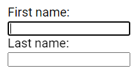
The height and width Attributes
The input height and width attributes specify the height and width of an <input type="image"> element.
Note: It's recommended to always specify both the height and width attributes for images. When these attributes are set, the browser can reserve the space required for the image when the page is loaded. Without them, the browser doesn't know the size of the image and can't reserve the appropriate space, which can lead to the page layout changing while the images load.
<form>
  <input type="image" src="img.jpg" alt="Submit" width="250px" height="150px">
</form>
The list Attribute
The list attribute in HTML refers to a <datalist> element that contains predefined options for an <input> element.
<form action="/submission_page.php">
 <input list="fruits">
 <datalist id="fruits">
   <option value="Apple">
   <option value="Mango">
   <option value="Orange">
   <option value="Banana">
   <option value="Peach">
 </datalist>
</form> 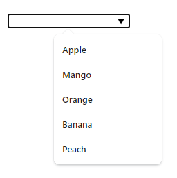
The autocomplete Attribute
The autocomplete attribute in HTML specifies whether a form or an input field should have autocomplete functionality on or off.
Autocomplete allows the browser to predict the value based on earlier typed values. When a user starts typing in a field, the browser may display options to fill in the field.
The autocomplete attribute works with <form> elements and the following <input> types: text, search, url, tel, email, password, datepickers, range and color.
<form action="/submission_page.php" autocomplete="on">
  <label for="fname">First name:</label>
  <input type="text" id="fname" name="fname"><br><br>
  <label for="lname">Last name:</label>
  <input type="text" id="lname" name="lname"><br><br>
  <label for="email">Email:</label>
  <input type="email" id="email" name="email" autocomplete="off"><br><br>
  <input type="submit" value="Submit">
</form>
Note: In certain browsers, you might need to enable the autocomplete function for it to work correctly. You can usually find this option under "Preferences" in the browser's menu.
Please check below options for the links to our previous or next tutorial.
