CSS transitions enable smooth changes to property values over a specified duration.
In this tutorial you will learn the following CSS properties:
-
transition -
transition-delay transition-duration-
transition-property -
transition-timing-function
CSS Transitions
To create a transition effect, you need to specify two things:
- The CSS property you want to animate.
- The duration of the effect.
If the duration is not specified, the transition won't be visible, as the default duration is 0.
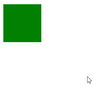
In the following example, we have a 100px by 100px div element and we have applied a transition effect to its width property with a duration of 3 seconds. The transition effect will activate when the specified CSS property (width) changes value. For example, when the user hovers over it, as shown below:
div {
  width: 100px;
  height: 100px;
  background: green;
  transition: width 3s;
}
div:hover {
  width: 200px;
}
Observe that when the cursor moves away from the element, it will smoothly revert to its original style.
Multiple Property Values
In the following example, a transition effect is applied to both the width and height properties, with a duration of 3 seconds for the width and 5 seconds for the height:
div {
 width: 100px;
 height: 100px;
 transition: width 3s, height 5s;
}
div:hover {
  width: 200px;
  height: 200px;
}
Speed Curve of the Transition
The transition-timing-function property defines how the speed of a transition changes over its duration.
This property can take the following values:
ease:Creates a transition with a slow start, accelerates, and then decelerates toward the end (this is the default value).linear:Produces a transition effect with a constant speed from start to finish.ease-in:Initiates the transition with a gradual acceleration.ease-out:Ends the transition with a gradual deceleration.ease-in-out:Combines both a slow start and a slow end.cubic-bezier(n,n,n,n):Allows you to customize the transition speed curve using a cubic-bezier function.
Here are two examples:
.div-one {
  transition-timing-function: ease;
}
.div-two {
  transition-timing-function: ease-in-out;
}
Transition Delay
The transition-delay property sets a delay (in seconds) before the transition effect begins.
In the following example, there is a 1-second delay before the transition starts:
div {
  transition-delay: 1s;
}
Transition + Transformation
The following example adds a transition effect to the transformation:
div {
 width: 100px;
 height: 100px;
 transition: width 2s, height 2s, transform 2s;
   transform-origin:left top;
}
div:hover {
  width: 150px;
  transform: scale(1.5);
  transform-origin: left top;
}
Individual or Shorthand Property
The CSS transition properties can be specified individually, like this:
div {
  transition-property: width;
  transition-duration: 2s;
  transition-timing-function: linear;
  transition-delay: 1s;
}
or by using the shorthand property transition
div {
  transition: width 2s linear 1s;
}