CSS transform property enable you to move, rotate, scale, and skew elements.
There are two types:
- 2D Transform
- 3D Transform
CSS 2D Transform Methods
With the CSS transform property, you can use the following 2D transformation methods:
translate()rotate()scaleX()scaleY()scale()skewX()skewY()skew()matrix()
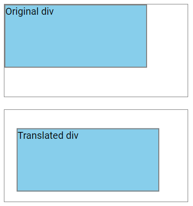
The translate() Method
The translate() method shifts an element from its current position based on the specified X-axis and Y-axis values.
In this example, the <div> element is moved 20 pixels to the right and 30 pixels down from its original position:
div {
 transform: translate(20px, 30px);
}
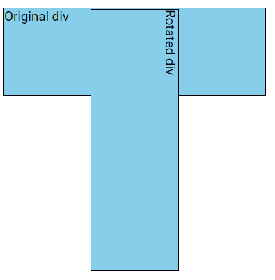
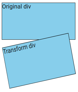
The rotate() Method
The rotate() method rotates an element either clockwise or counterclockwise by a specified number of degrees.
In this example below, the <div> element is rotated by 15 degrees clockwise:
div {
 transform: rotate(15deg);
}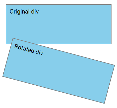
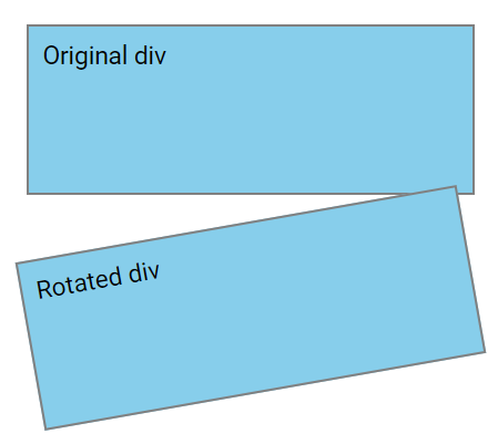
Note: Using negative values will rotate the element counterclockwise.
In the example below, the <div> element is rotated -10 degrees counterclockwise:
div {
 transform: rotate(-10deg);
}
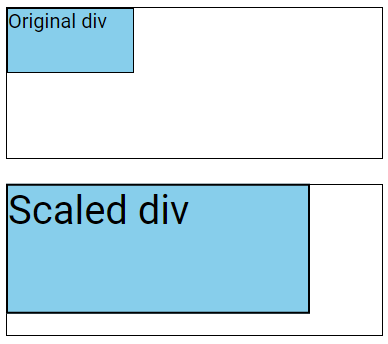
The scale() Method
The scale() method adjusts the size of an element based on the specified width and height parameters.
div {
 transform: scale(2, 2);
}
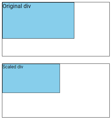
The following example decreases the size of <div> element by 20% of its original width and height:
div {
 transform: scale(0.8, 0.8);
}
Note: You can use the scaleX() and scaleY() methods to modify the width and height of an element separately respectively, while keeping the other value same. These methods accept single values.
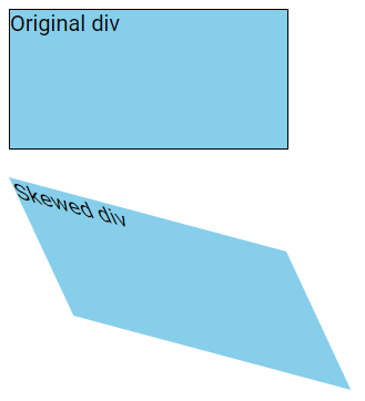
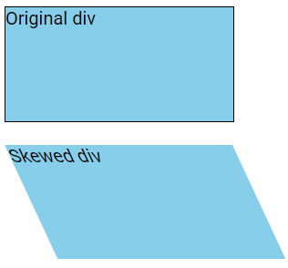
The skew() Method
The skew() method skews an element along both the X and Y axes by the specified angles.
In the example below, the <div> element is skewed 25 degrees along the X-axis and 15 degrees along the Y-axis:
div {
 transform: skew(25deg, 15deg);
}
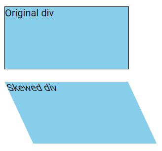
If the second parameter is not provided, it defaults to zero. Therefore, the example below skews the <div> element 25 degrees along the X-axis with no skewing along the Y-axis:
div {
 transform: skew(25deg);
}
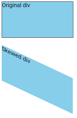
The skewX() Method
The skewX() method skews an element along the X-axis by a specified angle.
In the example below, the <div> element is skewed 25 degrees along the X-axis:
div {
 transform: skewX(25deg);
} 
The skewY() Method
The skewY() method skews an element along the Y-axis by a specified angle.
In the example below, the <div> element is skewed 25 degrees along the Y-axis:
div {
 transform: skewY(25deg);
}
The matrix() Method
The matrix() method consolidates all 2D transform functions into a single transformation.
It takes six parameters, which use mathematical functions to perform rotation, scaling, translation, and skewing of elements.
The parameters are as follows:
matrix(scaleX(), skewY(), skewX(), scaleY(), translateX(), translateY())
div {
  transform: matrix(0.9, -0.2, 0.2, 1.1, 1, 2);
}
CSS 3D Transforms Methods
CSS also supports 3D transformations.
With the CSS transform property you can use the following 3D transformation methods:
rotateX()rotateY()rotateZ()
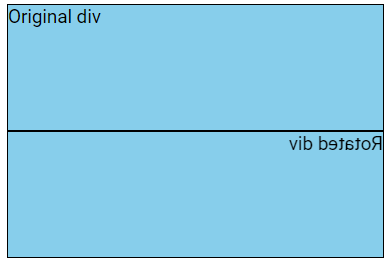
The rotateX() Method
The rotateX() method rotates an element around its X-axis at a given degree:
div {
  width: 300px;
  height: 100px;
  background-color: lightblue;
  border: 2px solid grey;
  transform: rotateX(180deg);
}
The rotateY() Method
The rotateY() method rotates an element around its Y-axis at a given degree:
div {
 transform: rotateY(180deg);
}
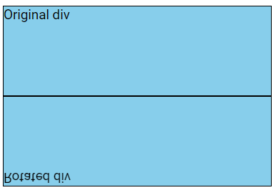
The rotateZ() Method
The rotateZ() method rotates an element around its Z-axis at a given degree:
div {
 transform: rotateZ(90deg);
}