In this tutorial, you’ll learn about multiple background images in CSS and other background properties.
CSS Multiple Background Images
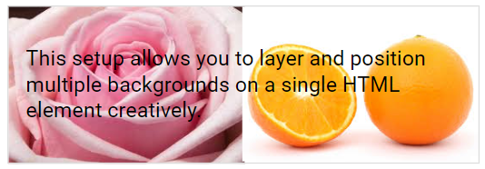
CSS enables you to apply multiple background images to an element using the background-image property.
Each background image is separated by a comma and the images are stacked in layers.
An example is given below.
div {
  background-image: url(image1.png), url(image2.png);
  background-position: left top, right bottom;
  background-repeat: no-repeat, no-repeat;
  padding: 15px;
}
You can specify multiple background images using either individual background properties or the shorthand background property.
Here's an example using the background shorthand property to achieve the same effect as before:
div {
  background: url(image1.png) left top no-repeat, url(image2.png)  right bottom no-repeat;
  padding: 15px;
}
Now we'll see how to use the following CSS properties:
background-sizebackground-originbackground-clip
CSS Background Size
The CSS background-size property lets you define the dimensions of background images.
You can set the size using lengths, percentages, or one of the two keywords: contain or cover.
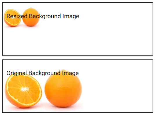
In the example below, the background image is resized to be significantly smaller than its original dimensions:
.div-one {
  border: 1px solid black;
  background: url(image.png);
  background-size: 100px 70px;
  background-repeat: no-repeat;
  padding: 10px;
}
.div-two{
  border: 1px solid black;
  background: url(image.png);
  background-repeat: no-repeat;
  padding: 10px;
}
Here, .div-one has a smaller specified background size (background-size: 100px 70px;), so the background image is appearing smaller, while .div-two does not, so the image is appearing in its original size, as you can see in below preview.
The two other possible values for background-size are contain and cover.
Contain
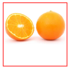
The contain keyword scales the background image to the maximum size possible while ensuring that both its width and height remain within the boundaries of the content area.
div {
  border: 1px solid black;
  height: 100px;
  width: 100px;
  background: url(image.png);
  background-repeat: no-repeat;
  background-size: contain;
}
Cover
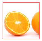
The cover keyword scales the background image to ensure that it fully covers the content area, with the image's width and height either matching or exceeding the size of the content area.
.div2 {
  border: 1px solid red;
  height: 100px;
  width: 100px;
  background: url(image.png);
  background-repeat: no-repeat;
  background-size: cover;
}
Define Sizes of Multiple Background Images
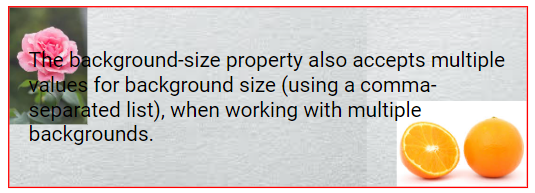
The background-size property can also take multiple values, separated by commas, allowing you to set different sizes for each background when using multiple background images.
div {
  background: url(image1.png) left top no-repeat, url(image2.png) right bottom no-repeat, url(image3.png) left top repeat;
  padding: 15px;
  background-size: 60px, 100px, auto;
  border: 1px solid red;
}
Full Page Background Image
If you want the entire page to have a background image:
- Specify the background image for the
<body>element - Adjust the image size as necessary
- Center it on the page
- Ensure that no scrollbars appear
body {
  background: url(image.png) no-repeat center fixed;
  background-size: cover;
}
CSS background-origin Property
The CSS background-origin property determines the starting point for positioning the background image.
It can take the following three values:
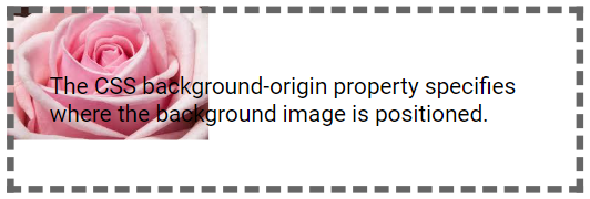
border-box:The background image begins at the upper left corner of the border.
div {
  border: 5px dashed #666666;
  padding: 25px;
  background: url(image.png);
  background-repeat: no-repeat;
  background-origin: border-box;
}
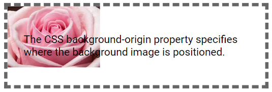
padding-box:(default) The background image starts from the upper left corner of the padding area.
div {
  border: 5px dashed #666666;
  padding: 25px;
  background: url(image.png);
  background-repeat: no-repeat;
}
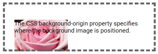
content-box:The background image starts from the upper left corner of the content area.
div {
  border: 5px dashed #666666;
  padding: 25px;
  background: url(image.png);
  background-repeat: no-repeat;
  background-origin: content-box;
}
CSS background-clip Property
The CSS background-clip property defines the limits up to where the background is applied.
It offers three options:
border-box:(default) The background extends to the outer edge of the border.
div {
  border: 5px dashed #666666;
  padding: 10px;
  background: #DDDDDD;
  background-clip: border-box;
}
padding-box:The background covers the area up to the outer edge of the padding.
div {
  border: 5px dashed #666666;
  padding: 10px;
  background: #DDDDDD;
  background-clip: padding-box;
}
content-box:The background is confined within the content area.
div {
  border: 5px dashed #666666;
  padding: 10px;
  background: #DDDDDD;
  background-clip: content-box;
}
Difference Between background-origin and background-clip
The background-origin property sets the starting point for positioning the background image within an element.
In contrast, the background-clip property defines how far the background extends or is clipped within the element's box model.

