CSS gradients, which are basically images allow you to create smooth color transitions between multiple colors.
There are three types of gradients in CSS:
Linear Gradients:Transition in a straight line, in any direction (down, up, left, right, or diagonally).Radial Gradients:Emanate outward from a central point, creating a circular or elliptical gradient.Conic Gradients:Rotate around a central point, creating a gradient that transitions in a circular pattern.
CSS Linear Gradients
To create a linear gradient, you must specify at least two color stops, which represent the colors to transition between. Additionally, you can set a starting point and define the direction (or angle) of the gradient.
Syntax
background-image: linear-gradient(direction, color-stop1, color-stop2, ...);
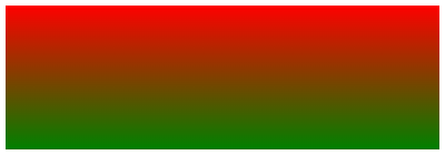
Top to Bottom (default)
This example demonstrates a linear gradient that begins at the top, starting with red and smoothly transitioning to green:
div {
  background-image: linear-gradient(red, green);
}
Left to Right
The following example illustrates a linear gradient that begins on the left, starting with red and transitioning to green:
div {
  background-image: linear-gradient(to right, red , green);
}
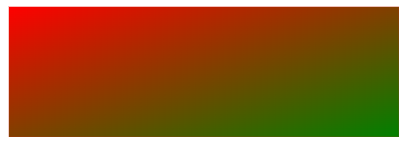
Diagonal
You can create a diagonal gradient by specifying both horizontal and vertical starting positions, for example:
div {
  background-image: linear-gradient(to bottom right, red, green);
}
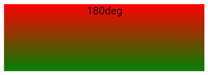
Using Angles
For greater control over the gradient's direction, you can specify an angle instead of using predefined directions (such as to bottom, to top, etc.).
An angle of 0deg corresponds to to top, 90deg corresponds to to right, and 180deg corresponds to to bottom.
Syntax
background-image: linear-gradient(angle, color-stop1, color-stop2);
Example
div {
  background-image: linear-gradient(180deg, red, green);
}
Using Multiple Color Stops
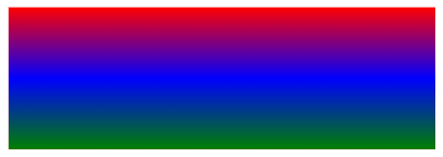
This example illustrates a linear gradient (from top to bottom) featuring multiple color transitions:
div {
  background-image: linear-gradient(red, blue, green);
}
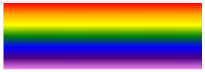
This example demonstrates how to create a top-to-bottom linear gradient with rainbow colors:
div {
  background-image: linear-gradient(red,orange,yellow,green,blue,indigo,violet);
}
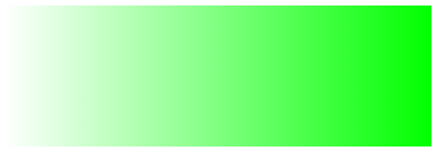
Using Transparency
To add transparency, use the rgba() function to define the color stops. The last parameter in the rgba() function ranges from 0 to 1, where 0 represents full transparency and 1 represents full color (no transparency).
Example
div {
  background-image: linear-gradient(to right, rgba(0,255,0,0), rgba(0,255,0,1));
}
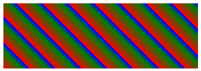
Repeating a linear-gradient
The repeating-linear-gradient() function is used to repeat linear gradients:
div {
  background-image: repeating-linear-gradient(45deg,red,green 7%,blue 10%);
}
CSS Radial Gradients
A radial gradient is centered around a specific point.
To create a radial gradient, you need to specify at least two color stops.
Syntax
background-image: radial-gradient(shape size at position, start-color, ..., last-color);
By default, shape is ellipse, size is farthest-corner, and position is center.
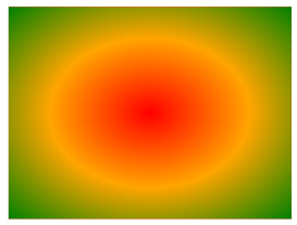
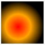
Evenly Spaced Color Stops (default)
This example illustrates a radial gradient with color stops that are evenly distributed.
div {
  background-image: radial-gradient(red, orange, green);
}
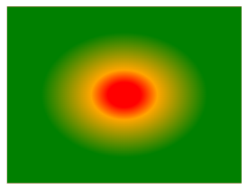
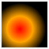
Differently Spaced Color Stops
This example demonstrates a radial gradient with color stops positioned at varying intervals.
div {
  background-image: radial-gradient(red 10%, orange 20%, green 50%);
}
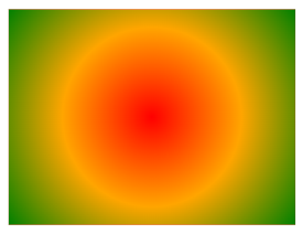
Set Shape
The shape parameter specifies the shape of the gradient and can be set to circle or ellipse, with ellipse being the default.
div {
  background-image: radial-gradient(circle, red, orange, green);
}
Use of Different Size Keywords
The size parameter determines the size of the radial gradient and can be set to one of four values:
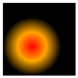
closest-side:The gradient extends to the nearest edge of the element.
div {
  background-image: radial-gradient(closest-side at 40% 60%, red, orange, black);
}
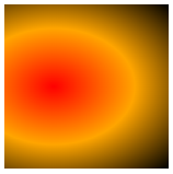
farthest-side:The gradient reaches the farthest edge of the element.
div {
  background-image: radial-gradient(farthest-side at 40% 60%, red, orange, black);
}
closest-corner:The gradient extends to the closest corner of the element.
div {
  background-image: radial-gradient(closest-corner at 40% 60%, red, orange, black);
}
farthest-corner:The gradient stretches to the farthest corner of the element.
div {
  background-image: radial-gradient(farthest-corner at 30% 50%, red, orange, black);
}
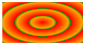
Repeating a radial-gradient
The repeating-radial-gradient() function is used to create radial gradients that repeat continuously.
div {
  background-image: repeating-radial-gradient(red, orange 20%, green 25%);
}
CSS Conic Gradients
A conic gradient features color transitions that rotate around a central point. To create a conic gradient, you need to specify at least two colors.
Syntax
background-image: conic-gradient([from angle] [at position,] color [degree], color [degree], ...);
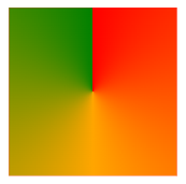
Conic Gradient: Three Colors
This example illustrates a conic gradient featuring three distinct colors.
div {
  background-image: conic-gradient(red, orange, green);
}
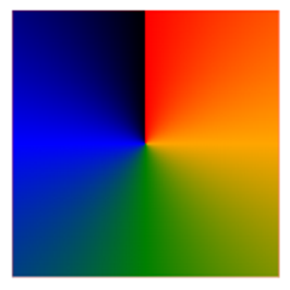
Conic Gradient: Five Colors
This example illustrates a conic gradient featuring five distinct colors.
div {
  background-image: conic-gradient(red, orange, green, blue, black);
}
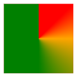
Conic Gradient: Three Colors and Degrees
This example demonstrates a conic gradient with three colors, each defined by specific angle degrees.
div {
  background-image: conic-gradient(red 45deg, orange 90deg, green 180deg);
}
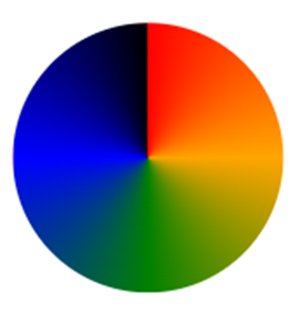
Create Pie Charts
To make a conic gradient appear like a pie chart, simply add border-radius: 50%; to a square HTML element.
div {
  background-image: conic-gradient(red, orange, green, blue, black);
  width: 150px;
  height: 150px;
  border-radius: 50%;
}
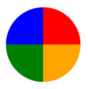
Here is another pie chart with defined degrees for all the colors:
div {
  background-image: conic-gradient(red 0deg, red 90deg, orange 90deg, orange 180deg, green 180deg, green 270deg, blue 270deg);
  width: 150px;
  height: 150px;
  border-radius: 50%;
}
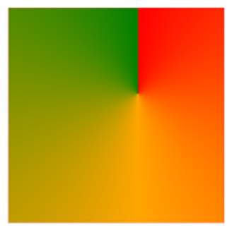
Conic Gradient With Specified "from angle"
The from angle specifies the angle by which the entire conic gradient is rotated.
The following example demonstrates a conic gradient with a from angle of 90 degrees:
div {
  background-image: conic-gradient(from 90deg, red, orange, green);
}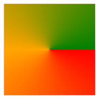
Conic Gradient With Specified "at position"
The at position defines the center point of the conic gradient.
The following example illustrates a conic gradient centered at 60% 40%:
div {
  background-image: conic-gradient(at 60% 40%, red, orange, green);
}
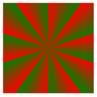
Repeating a Conic Gradient
The repeating-conic-gradient() function is used to create conic gradients that repeat themselves.
div {
  background-image: repeating-conic-gradient(red 10%, green 20%);
  border-radius: 50%;
}