The Flexbox Layout module simplifies the process of creating flexible, responsive layouts, eliminating the need to rely on float or positioning techniques.
Before the introduction of the Flexbox Layout module, web design primarily relied on four layout models:
- Block layout for structuring sections of a webpage
- Inline layout for arranging text
- Table layout for organizing two-dimensional table data
- Positioned layout for placing elements with specific coordinates
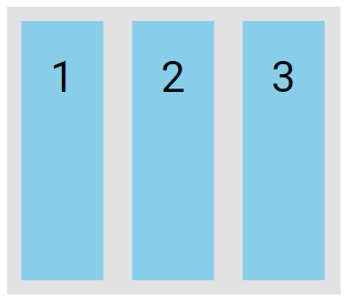
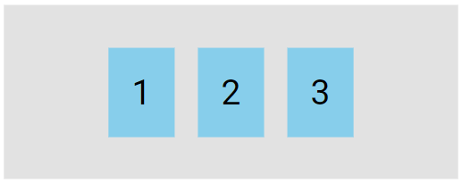
Flexbox Example
<div class="flex-container">
  <div>1</div>
  <div>2</div>
  <div>3</div>
</div>
.flex-container {
display: flex;
background-color: #dddd;
}
.flex-container > div {
background-color: #87CEEB;
margin: 10px;
padding: 20px;
font-size: 30px;
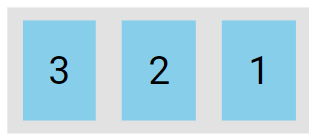
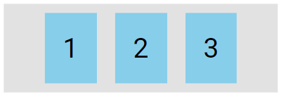
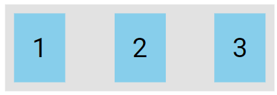
}A Flexible Layout must have a parent element with the display property set to flex.
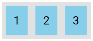
The preview of the above example is a flex container (gray area) with three flex items (blue boxes), as shown below.

Key Flexbox Properties
The flexbox properties are:
flex-directionflex-wrapflex-flowjustify-contentalign-itemsalign-content
The flex-direction Property
The flex-direction property determines the direction in which the flex container arranges its flex items.
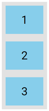
The column value stacks the flex items vertically (from top to bottom):
.flex-container {
  display: flex;
  flex-direction: column;
}
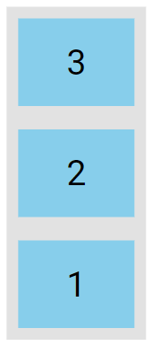
The column-reverse value stacks the flex items vertically (but from bottom to top):
.flex-container {
  display: flex;
  flex-direction: column-reverse;
}
The row value stacks the flex items horizontally (from left to right):
.flex-container {
  display: flex;
  flex-direction: row;
}
The row-reverse value stacks the flex items horizontally (but from right to left):
.flex-container {
  display: flex;
  flex-direction: row-reverse;
}
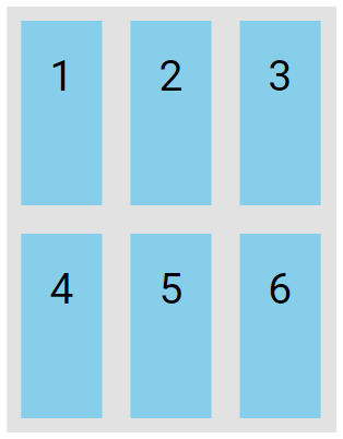
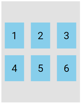
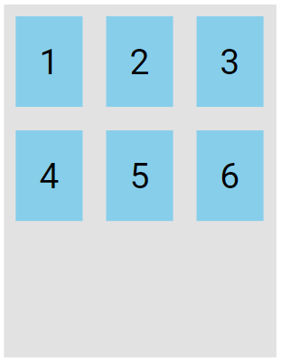
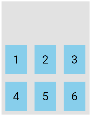
The flex-wrap Property
The flex-wrap property determines whether the flex items should wrap onto multiple lines.
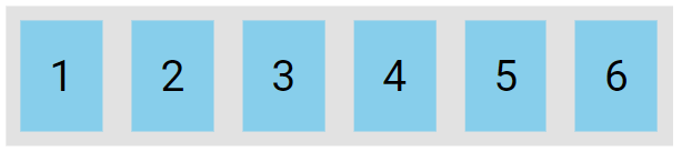
The examples below include 6 flex items to clearly illustrate the effect of the flex-wrap property.
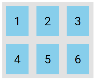
The wrap value specifies that the flex items will wrap if necessary:
.flex-container {
  display: flex;
  flex-wrap: wrap;
}
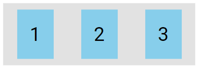
The nowrap value specifies that the flex items will not wrap, which is the default behavior.
.flex-container {
  display: flex;
  flex-wrap: nowrap;
}
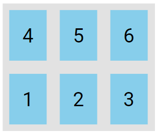
The wrap-reverse value specifies that the flexible items will wrap if necessary, in reverse order:
.flex-container {
  display: flex;
  flex-wrap: wrap-reverse;
}
The flex-flow Property
The flex-flow property is a shorthand that sets both the flex-direction and flex-wrap properties.
.flex-container {
  display: flex;
  flex-flow: row wrap;
}
The justify-content Property
The justify-content property is used to align the flex items:
The center value aligns the flex items at the center of the container:
.flex-container {
  display: flex;
  justify-content: center;
}
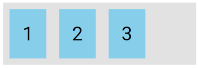
The flex-start value aligns the flex items at the beginning of the container (this is default):
.flex-container {
  display: flex;
  justify-content: flex-start;
}
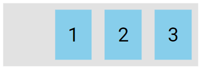
The flex-end value aligns the flex items at the end of the container.
.flex-container {
  display: flex;
  justify-content: flex-end;
}
The space-around value distributes the flex items with equal space before, between, and after them.
.flex-container {
  display: flex;
  justify-content: space-around;
}
The space-between value displays the flex items with space between the lines:
.flex-container {
  display: flex;
  justify-content: space-between;
}
The align-items Property
The align-items property is used to align the flex items.
The center value aligns the flex items in the center of the container.
.flex-container {
  display: flex;
  height: 200px;
  align-items: center;
}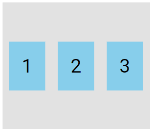
The flex-start value aligns the flex items at the top of the container:
.flex-container {
  display: flex;
  height: 200px;
  align-items: flex-start;
}
The flex-end value aligns the flex items at the bottom of the container:
.flex-container {
  display: flex;
  height: 200px;
  align-items: flex-end;
}
The stretch value stretches the flex items to fill the container, which is the default behavior.
.flex-container {
  display: flex;
  height: 200px;
  align-items: stretch;
}
The baseline value aligns the flex items such as their baselines aligns:
<div class="flex-container">
  <div><h1>1</h1></div>
  <div><h6>2</h6></div>
  <div><h3>3</h3></div>
  <div><small>4</small></div>
</div>
.flex-container {
display: flex;
height: 200px;
align-items: baseline;
}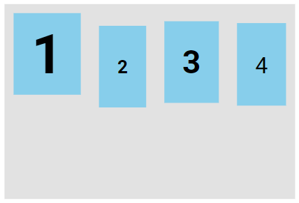
Note: The example uses varying font sizes to show that the items are aligned according to the text baseline.
The align-content Property
The align-content property is used to align the flex lines.
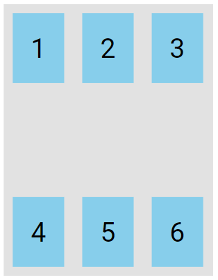
In these examples, we use a container that is 300 pixels high and has the flex-wrap property set to wrap to better illustrate the align-content property.
The space-between value displays the flex lines with equal space between them:
.flex-container {
  display: flex;
  height: 300px;
  flex-wrap: wrap;
  align-content: space-between;
}
The space-around value displays the flex lines with space before, between, and after them:
.flex-container {
  display: flex;
  height: 300px;
  flex-wrap: wrap;
  align-content: space-around;
}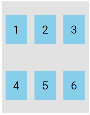
The stretch value expands the flex lines to fill the remaining space, which is the default behavior.
.flex-container {
  display: flex;
  height: 300px;
  flex-wrap: wrap;
  align-content: stretch;
}
The center value displays the flex lines in the middle of the container:
.flex-container {
  display: flex;
  height: 300px;
  flex-wrap: wrap;
  align-content: center;
}
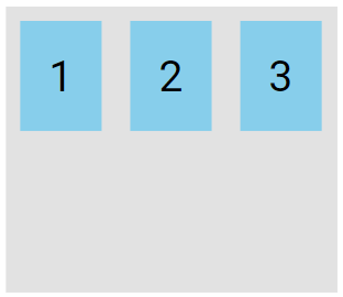
The flex-start value displays the flex lines at the start of the container:
.flex-container {
  display: flex;
  height: 300px;
  flex-wrap: wrap;
  align-content: flex-start;
}
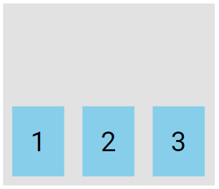
The flex-end value displays the flex lines at the end of the container:
.flex-container {
  display: flex;
  height: 300px;
  flex-wrap: wrap;
  align-content: flex-end;
}
Perfect Centering
In the following example we will solve a very common style problem: perfect centering.
SOLUTION: Set both the justify-content and align-items properties to center to perfectly center the flex item.
.flex-container {
  display: flex;
  height: 300px;
  justify-content: center;
  align-items: center;
}
CSS Flex Items
The direct child elements of a flex container automatically become flexible (flex) items.
The flex item properties are:
OrderFlex-growFlex-shrinkFlex-basisFlex
The order Property
The order property specifies the order of the flex items. The first flex item in the code doesn't have to be the first item in the layout. The order value is a number, with a default value of 0.
<div class="flex-container">
  <div style="order: 3">1</div>
  <div style="order: 2">2</div>
  <div style="order: 4">3</div>
  <div style="order: 1">4</div>
</div>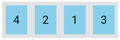
The flex-grow Property
The flex-grow property determines how much a flex item will expand in proportion to the other flex items.
<div class="flex-container">
  <div style="flex-grow: 1">1</div>
  <div style="flex-grow: 3">2</div>
  <div style="flex-grow: 5">3</div>
</div>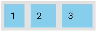
The flex-shrink Property
The flex-shrink property determines how much a flex item will shrink in relation to the other flex items.
<div class="flex-container">
  <div>1</div>
  <div>2</div>
  <div style="flex-shrink: 3">3</div>
  <div>4</div>
</div>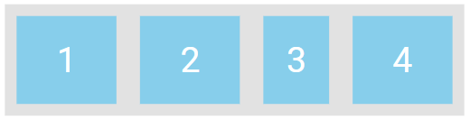
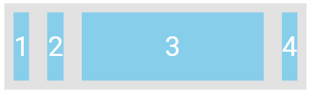
The flex-basis Property
The flex-basis property specifies the initial length of a flex item.
<div class="flex-container">
  <div>1</div>
  <div>2</div>
  <div style="flex-basis: 200px">3</div>
  <div>4</div>
</div>
The above code will set the initial length of the third flex item to 200 pixels, as shown below.
The flex Property
The flex property is a shorthand for the flex-grow flex-shrink and flex-basis properties.
<div class="flex-container">
  <div>1</div>
  <div>2</div>
  <div style="flex: 0 0 200px">3</div>
  <div>4</div>
</div> 
The align-self Property
The align-self-property defines the alignment for a specific item within the flex container.
This property overrides the default alignment set by the container’s align-items property.
<div class="flex-container">
  <div>1</div>
  <div>2</div>
  <div style="align-self: center">3</div>
  <div>4</div>
</div> 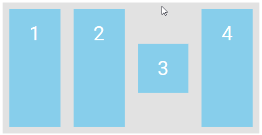
Align the second flex item at the top of the container, and the third flex item at the bottom of the container:
<div class="flex-container">
  <div>1</div>
  <div style="align-self: flex-start">2</div>
  <div style="align-self: flex-end">3</div>
  <div>4</div>
</div> 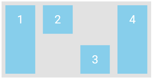
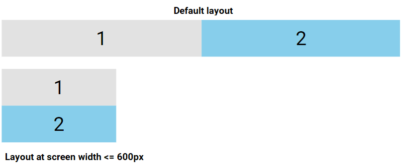
Responsive Flexbox
Media queries allow you to design custom layouts customized to various screen sizes and devices.
For example, if you want to design a layout that displays two columns on larger screens and switches to a single column on smaller screens like phones and tablets, you can adjust the flex-direction from row to column at a specific breakpoint (e.g., 600px):
.flex-container {
  display: flex;
  flex-direction: row;
}
@media (max-width: 600px) {
  .flex-container {
    flex-direction: column;
  }
}