The CSS Grid Layout Module provides a grid-based system with rows and columns, simplifying the process of designing web pages without relying on floats or positioning.
Grid Elements
A grid layout is made up of a parent element containing one or more child elements.
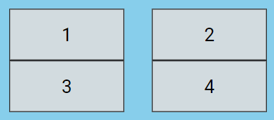
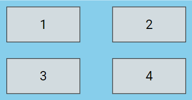
<div class="grid-container">
  <div class="grid-item">1</div>
  <div class="grid-item">2</div>
  <div class="grid-item">3</div>
  <div class="grid-item">4</div>
</div>
.grid-container {
display: grid;
grid-template-columns: auto auto;
background-color: skyblue;
padding: 10px;
}
.grid-item {
background-color:#dddddd;
border: 1px solid #333333;
padding: 15px;
font-size: 20px;
text-align: center;
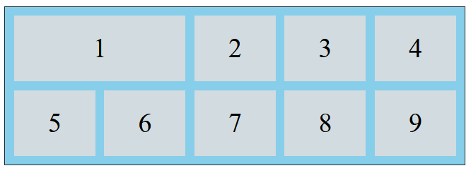
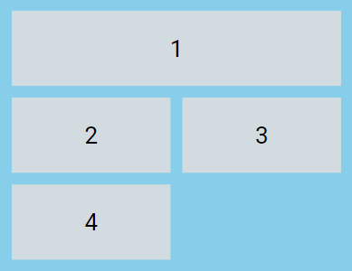
}This above code will create a responsive two-column grid where each cell automatically adjusts its size to fit the content, as shown below.
Display Property
An HTML element turns into a grid container when its display property is set to either grid or inline-grid.
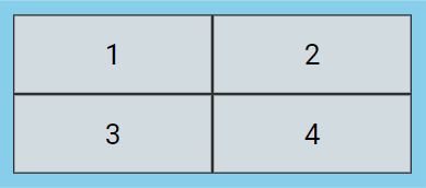
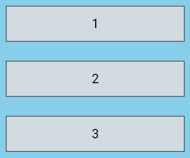
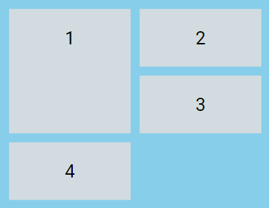
.grid-container {
  display: grid;
}
This above example used display: grid; to make a block-level grid container, as shown below.
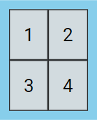
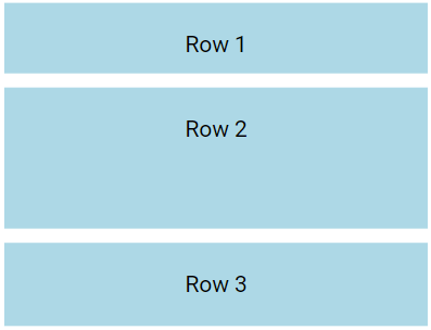
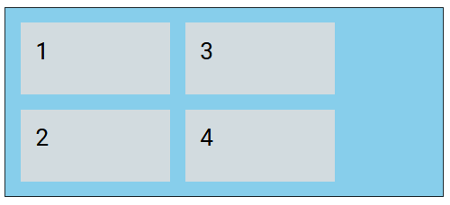
.grid-container {
   display: inline-grid;
}
This above example used display: inline-grid; to make an inline grid container, as shown below
Grid Columns
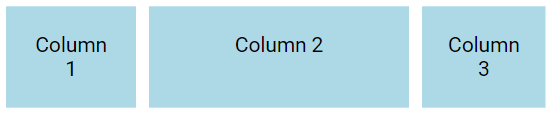
The grid-template-columns property allows you to create complex and responsive layouts by defining how the grid container should be divided into vertical sections.
.grid-container {
  display: grid;
  grid-template-columns: 100px 200px 100px; /* Three columns with varying sizes */
  gap: 10px;
}
Grid Rows
The grid-template-rows property allows you to structure the horizontal layout of a grid container, controlling the height of each row.
.grid-container {
  display: grid;
  grid-template-rows: 50px 100px 100px; /* Defines 3 rows with varying heights */
  gap: 10px;
}
Grid Gaps
The spaces between columns and rows are known as gaps.
You can modify the gap size using one of these properties:
column-gaprow-gapgap
The column-gap property sets the gap between the columns:
.grid-container {
  display: grid;
  grid-template-columns: auto auto;
  column-gap: 30px; /* Space between columns */
}
The row-gap property sets the gap between the rows:
.grid-container {
  display: grid;
  grid-template-rows: auto auto;
  row-gap: 30px; /* Space between rows */
}
The gap property is a shorthand for the row-gap and column-gap properties.
.grid-container {
  display: grid;
  grid-template-columns: auto auto;
  gap: 25px 50px;
}
Grid Lines
The lines between columns are known as column lines, while the lines between rows are called row lines.
Grid Item Positioning
Refer to line numbers when placing a grid item in a grid container:
.item1 {
  grid-column-start: 1;
  grid-column-end: 3;
}
.item1 {
  grid-row-start: 1;
  grid-row-end: 3;
}
Grid-Auto-Flow
The grid-auto-flow; Specifies how auto-placed items are inserted in the grid
.grid-container {
  display: grid;
  grid-auto-flow: column;
}
CSS Grid-Template-Areas
The grid-template-areas; Specifies how to display columns and rows, using named grid items
.item1 {
  grid-area: Area1;
}
.grid-container {
  display: grid;
  grid-template-areas: "Area1 Area1 . . .";
}