In this tutorial, you'll learn how to add shadows to both text and other HTML elements.
The following CSS properties are used to create shadows:
text-shadowbox-shadow
CSS Text Shadow
The text-shadow property in CSS adds a shadow effect to text.
Syntax
h2 {
 text-shadow: 3px 3px 6px red;
}
Where:
- First value is for offset-x
- Second value is for offset-y
- Third value is for blur radius
- And the fourth is for color
In its most basic form, you only need to define the horizontal shadow and the vertical shadow.
h2 {
 color: green;
 text-shadow: 3px 3px;
}
To apply a color to the shadow, you can use:
h2 {
  color: green;
  text-shadow: 3px 3px red;
}

To apply a blur effect, you can use:
h2 {
  color: green;
  text-shadow: 3px 3px 6px red;
}
To apply a glow effect, set the first two values to zero:
h2 {
 color: white;
 text-shadow: 0 0 6px blue;
}
CSS Multiple Shadows
To apply multiple shadows to text, you can use a comma-separated list of shadows.
The example below demonstrates a combination of blue and red glow effects.
h2 {
 color: white;
 text-shadow: 0 0 6px blue, 0 0 4px red;
}
The example below displays white text with shadows in red, green, and yellow.
h2 {
 color: white;
 text-shadow: 0 0 10px red, 0 0 20px green, 0 0 30px yellow;
}
Border Using Text Shadow
You can also use the text-shadow property to create a solid border around text, without adding a shadow effect.
h2 {
  color: white;
  text-shadow: -2px 0 red, 0 2px red, 2px 0 red, 0 -2px red;
}
CSS Box Shadow
The box-shadow property in CSS is used to add one or more shadows to an HTML element.
Syntax
h2 {
  box-shadow: 12px 12px 8px 15px yellow;
}
Where:
- First value is for x-offset. It is used to set the horizontal position of the shadow. Use a positive value to place the shadow on the right side of the box, and a negative value to position it on the left side.
- Second value is for y-offset. It is used to set the vertical position of the shadow. Use a positive value to place the shadow below the box, and a negative value to position it above the box.
- Third value is for blur. This attribute is optional and is used to blur the shadow of the box.
- Fourth value is for spread. This attribute is used to set the size of the shadow. The extent of the shadow's spread is determined by the value specified.
- And the fifth value is for color. This optional attribute is used to set the color of the shadow.
Horizontal and Vertical Shadows
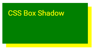
Basic usage: Simply define the horizontal and vertical shadow offsets. The shadow will default to the current text color.
.shadow {
  color: yellow;
  background-color: green;
  box-shadow: 8px 8px;
}
Shadow Color
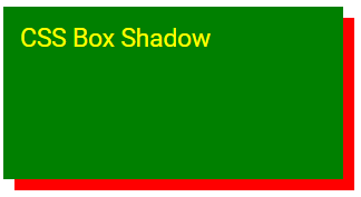
The color parameter specifies the shadow's color.
.shadow {
  color: yellow;
  background-color: green;
  box-shadow: 8px 8px red;
}
Blur Effect
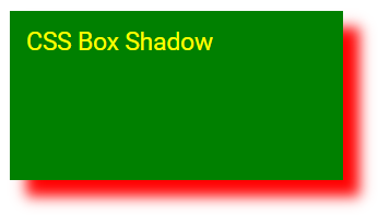
The blur parameter sets the blur radius; a higher number results in a more blurred shadow.
.shadow {
  color: yellow;
  background-color: green;
  box-shadow: 12px 12px 10px red;
}
Spread Radius
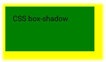
The spread parameter determines the spread radius. A positive value expands the shadow, while a negative value reduces its size.
.shadow {
  color: black;
  background-color: green;
  box-shadow: 8px 8px 6px 15px yellow;
}
Inset Parameter
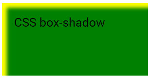
The inset parameter changes the shadow from an outer shadow to an inner shadow
.shadow {
  color: black;
  background-color: green;
  box-shadow: 8px 8px 6px yellow inset;
}
Multiple Shadows
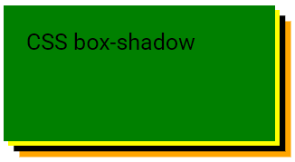
An element can have multiple shadows, separated by a comma.
.shadow {
  color: black;
  background-color: green;
  box-shadow: 4px 4px yellow, 9px 9px black, 14px 14px orange;
}
