Category(s)
Topic(s)
The CSS border-radius property is used to add rounded corners to an HTML element.
An example is given below.
div {
  border-radius: 20px;
  background: gray;
  padding: 15px;
  width: 150px;
  height: 100px;
}
The result is a gray box with rounded corners, as shown below.

The border-radius property is a shorthand for setting the following properties:
-
border-top-left-radiusSpecifies the curvature of the border's top-left corner. -
border-top-right-radiusSpecifies the curvature of the border's top-right corner. -
border-bottom-right-radiusSpecifies the curvature of the border's bottom-right corner. -
border-bottom-left-radiusSpecifies the curvature of the border's bottom-left corner.
Specify Each Corner
You can use the above properties to specify border radius for each corner separately. Here’s how it works:
border-top-left-radius
div {
  border-top-left-radius: 30px;
}
Preview:

border-top-right-radius
div {
  border-top-right-radius: 30px;
}
Preview:

border-bottom-right-radius
div {
  border-bottom-right-radius: 30px;
}
Preview:

border-bottom-left-radius
div {
  border-bottom-left-radius: 30px;
}
Preview:

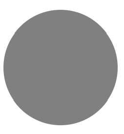
A Circular Shape
You can also convert a square element in to a circular element by using the below CSS.
div {
  border-radius: 50%;
  width: 150px;
  height: 150px;
}
Preview:
Browser Compatibility
If you're targeting older browsers, you can use the following approach:
div {
  -webkit-border-radius: 10px; /* For older Safari and Chrome */
  -moz-border-radius: 10px;    /* For older Firefox */
  border-radius: 10px;         /* Standard syntax */
}