In this tutorial, you'll learn how to style HTML form fields via CSS.
An example is given below.
Input Width
You can use the width property to set the width of the input field.
input {
  width: 100%;
}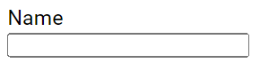
The example above sets the input field width equal to the width of the available container space and applies to all <input> elements. To style a specific input type, you can use attribute selectors:
input[type=text]: Selects only text fields.input[type=password]: Selects only password fields.input[type=number]: Selects only number fields.- And so on.
Input Padding and Margin
You can use the padding property to add space inside the text field.
When you have multiple input fields, you can use the margin property to add more space outside of them.
input[type=text] {
width: 100%;
padding: 10px 18px;
margin: 6px;
box-sizing: border-box;
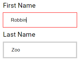
}In this example, the space outside the input value and inside the input border is padding and the space outside the input border is margin, as shown below.
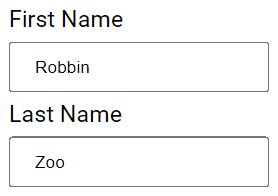
Note that we have set the box-sizing property to border-box. This ensures that the padding and borders are included in the total width and height of the elements.
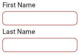
Bordered Inputs
Use the border property to modify the border's size and color, and use the border-radius property to add rounded corners.
input[type=text] {
  border: 1px solid red;
  border-radius: 10px;
}
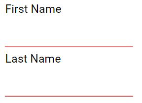
If you only want a specific side border, use the respective side border property, for example:
input[type=text] {
  border: none;
  border-bottom: 1px solid red;
}
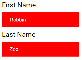
Colored Inputs
Utilize the background-color property to add a background color to the input, and the color property to change the text color.
input[type=text] {
  background-color: red;
  color: white;
}
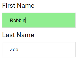
Focused Inputs
By default, some browsers add a blue outline around the input when it receives focus (clicked on). You can remove this behavior by adding outline: none; to the input.
Use the :focus selector to apply specific styles to the input field when it gets focus.
input[type=text]:focus {
  outline: none;
  background-color: lightgreen;
}
input[type=text]:focus {
  outline: none;
  border: 1px solid red;
}
Input with icon/image
If you want to include an icon inside the input, use the background-image property and position it with the background-position property. Additionally, add a large left padding to reserve space for the icon.
input[type=text] {
background-color: white;
background-image: url(icon.png);
background-position: 5px 6px;
background-repeat: no-repeat;
padding: 12px 10px 12px 40px;
background-size: 40px;
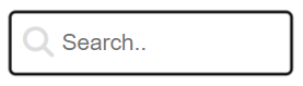
}A preview of the above CSS is given below, where the image icon.png represents the magnifying glass icon.
Animated Search Input
In this example, we use the CSS transition property to animate the width of the search input when it gains focus.
input[type=text] {
transition: width 0.4s ease-in-out;
}
input[type=text]:focus {
width: 100%;
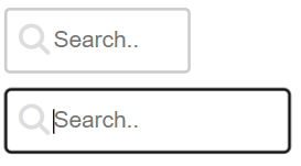
}A preview of above CSS is shown below, where the first image represents the search field in its default state and the second image represents the same search field in its focused state.
Styling Textareas
You can also style textareas. For example, use the:
widthandheightproperties to define the sizepaddingandbox-sizingproperties to adjust spacingborderandborder-radiusproperties to define borderbackground-colorproperty to define background color- and
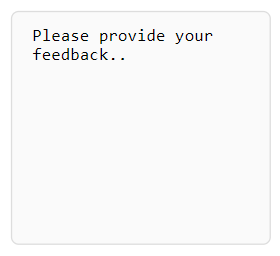
resizeproperty to prevent textareas from being resized and disable the "grabber" in the bottom-right corner, as shown below:
textarea {
  width: 100%;
  height: 180px;
  padding: 10px 15px;
  box-sizing: border-box;
  border: 1px solid #ddd;
  border-radius: 6px;
  background-color: #fafafa;
  resize: none;
}
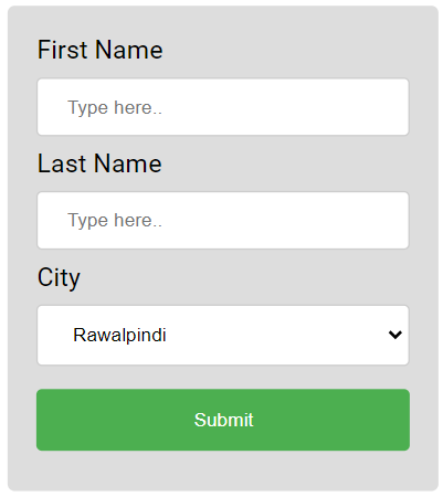
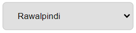
Styling Select Fields
You can also style select fields. For example;
select.menu {
  width: 100%;
  padding: 12px 18px;
  border: 1px solid #ccc;
  border-radius: 6px;
  background-color: #e0e0e0;
}
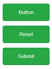
Styling Input Buttons
You can also style select input buttons. For example;
input[type=button], input[type=submit], input[type=reset] {
  background-color: #28a745;
  border: 1px solid #1e7e34;
  color: #fff;
  padding: 14px 28px;
  text-align: center;
  margin: 6px 3px;
  cursor: pointer;
  border-radius: 5px;
}
Responsive Form Fields
You can create responsive form fields by setting the width property to 100%. Also, if you want to enforce certain minimum and maximum width, set the respective CSS properties to those values, as shown below.
input, textarea {
width: 100%;
max-width: 250px;
min-width: 200px;
padding: 10px;
box-sizing: border-box;
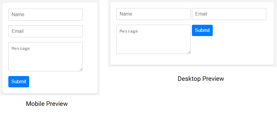
}If you want them to stack side-by-side on larger screens instead of stacking vertically, set the display property to inline-block. For example:
input, textarea {
  display: inline-block;
  vertical-align: top;
  width: 100%;
  max-width: 250px;
  min-width: 200px;
  padding: 10px;
  box-sizing: border-box;
}
In the above example, the form fields will align side-by-side on desktops and tablets while on mobile screens they will stack vertically, as shown in the below preview.