The <div> element is utilized as a container for grouping other HTML elements.
Most webpages consists of multiple <div> elements stacked together.
By default, the <div> element is a block-level element, which occupies the entire available width by default, and is accompanied by line breaks before and after.
<div>
  <h2>Heading</h2>
  <p>This is a paragraph</p>
</div>
<div>
  <h2>Heading</h2>
  <p>This is a paragraph</p>
</div>
The <div> element mostly contains style, class, and id attributes.
Center align a <div> element
To center-align a <div> element that isn't 100% wide, you can achieve this by setting the CSS margin property to auto.
<style>
div {
  width:250px;
  margin:auto;
}
</style> 
Multiple <div> elements
Multiple <div> containers can coexist on the same page.
<div class="section">
  <div>
    <p>Box 1</p>
  </div>
  <div>
    <p>Box 2</p>
  </div>
  <div>
    <p>Box 3</p>
  </div>
 </div>
Aligning <div> elements side by side
When constructing web pages, it's common to arrange two or more <div> elements side by side.
There are many methods, which can be used to align elements side by side, all of which involve CSS styling.:
Some common approaches are:
Inline-block
Changing the <div> element's display property from block to inline-block eliminates the line break before and after the <div> elements, causing them to display side by side rather than on top of each other.
<style>
.section {
 width: 500px;
}
.section div {
  width: 30%;
  display: inline-block;
}
</style> 
Flex
The CSS Flexbox Layout Module was introduced to simplify the creation of flexible and responsive layout structures without relying on float or positioning.
To utilize the CSS flex method, encapsulate the <div> elements within another <div> element and designate it as a flex container.
<style>
.section {
  display: flex;
}
.section > div {
  width:33%;
}
</style> 
Grid
The CSS Grid Layout Module provides a grid-based layout system, enabling the creation of web pages without the need for floats and positioning. It is similar to flex but offers the capability to define multiple rows, and position each row individually.
To utilize the CSS grid method, wrap the <div> elements with another <div> element and designate it as a grid container. Additionally, you must specify the width of each column.
<style>
.section {
  display: grid;
  grid-template-columns: 15% 15% 15%;
}
</style> 
Float
The CSS float is property is utilized for positioning and formatting content, enabling elements to float alongside each other rather than stacking atop one another.
<style>
.section {
  width: 500px;
  display: block;
  font-size: 20px;
  font-family: roboto;
  padding: 50px;
}
.section div {
  width: 20%;
  float: left;
  padding-left: 2%;
}
</style>
HTML class Attribute
The HTML class attribute is used to assign a class to an HTML element.
Multiple HTML elements can be assigned the same class.
To define a class in CSS, start with a period (.) followed by the class name.
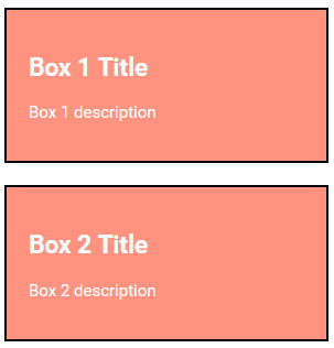
In the example below, three <div>elements are assigned a class named "box". All three <div> elements will be styled uniformly based on the .box style definition in the head section.
<style>
.box {
  background-color: tomato;
  color: white;
  border: 2px solid black;
  margin: 20px;
  padding: 20px;
}
</style>
<div class="box">
  <h2>Box 1 Title</h2>
  <p>Box 1 description</p>
</div>
<div class="box">
  <h2>Box 2 Title</h2>
  <p>Box 2 description</p>
</div>
Notes:
- The class attribute can be applied to any HTML element.
- Class names are case-sensitive.
Multiple Classes
To assign multiple classes, separate the class names with spaces, like this: <div class="box main">. The element will inherit styles from all specified classes.
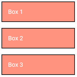
In the example below, the first <div> element is a member of both the "box" and "main" classes, and will be styled according to the definitions of both classes.
<div class="box main">Box 1</div>
<div class="box">Box 2</div>
<div class="box">Box 3</div>
Class Sharing
Various HTML elements can reference the same class name.
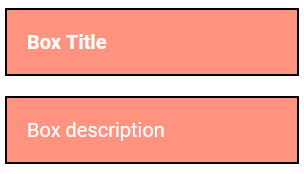
In the example below, both <h2> and <p> elements are associated with the "box" class and will consequently share the same style.
<h2 class="box">Box Title</h2>
<p class="box">Box description</p>
HTML id Attribute
The HTML id attribute is utilized to designate a unique identifier for an HTML element.
Note: It is not permissible to have more than one element with the same id within an HTML document. It must be unique!
The id attribute is used to reference a specific style declaration in a style sheet. It is also employed by JavaScript to access and manipulate the element with the specific id.
Syntax for id:
Prepend a hash character (#) to an id name. Then, specify the CSS properties within curly braces {}.
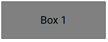
In the example below, a <div> element is associated with the id name "myID". This <div> element will be styled like:
<style>
#myID {
  background-color: grey;
  color: black;
  padding: 40px;
  text-align: center;
  border: 1px solid #000;
}
</style>
<div id="myID">Box 1</div>
Notes:
- The id name is case-sensitive!
- The id name must consist of at least one character, cannot commence with a number, and must not include whitespace characters (spaces, tabs, etc.).
Class vs. ID
A class name can be applied to multiple HTML elements, whereas an id name should be unique and used by only one HTML element on a page.
HTML Bookmarks with ID and Links
HTML bookmarks enable readers to navigate to specific sections of a webpage.
Bookmarks are particularly helpful for long pages.
Click here to learn more about HTML bookmarks.
JavaScript Usage
HTML classes and ids are also employed by JavaScript to execute tasks specific to those elements.
<!DOCTYPE html>
<html>
<head>
  <script>
    document.getElementById("myid").innerHTML = "This is JavaScript";
  </script>
</head>
<body>
  <div id="myid"></div>
</body>
</html>
You'll learn more about this in our JavaScript Guide.
Please check below options for the links to our previous or next tutorial.
