The CSS float property determines the placement of an element by specifying whether it should float to the left, right, or not at all within its container.
For example, in the below preview, the left image is floated to the left side of the text and the right image is floated to the right side of the text.

The float property can take the following values:
left:The element will float to the left side of its container.right:The element will float to the right side of its container.none:The element will not float and will appear in its normal position within the text flow (default value).inherit:The element will inherit the float value from its parent element.
float: left;
Here’s an example demonstrating how to make an image float to the left within a block of text:
.image {
  float: left;
}
float: right;
Here’s an example that demonstrates how to make an image float to the right within a block of text:
.image {
  float: right;
}
float: none;
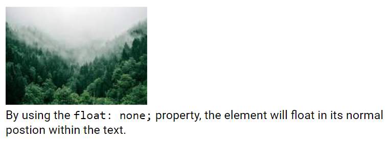
The element will not float and will appear in its normal position within the text flow and the text will not wrap around it. This is the default value.
.image {
  float: none;
} 
Float Next To Each Other
Normally, div elements are displayed one below the other. However, by using float: left;, we can make elements float next to each other:
.box1 {
  float: left;
  background:gray;
}
.box2 {
  float: left;
  background: darkgray;
}
.box3 {
  float: left;
  background:black;
}
In this example, the three div elements having classes .box1, .box2 and .box3 are floated to the left, allowing them to be displayed side by side instead of stacking on top of each other.
The clear Property
When we use the float property and want the next element to appear below (not to the right or left), we need to use the clear property.
The clear property specifies how an element should behave in relation to floating elements next to it.
The clear property can take one of the following values:
none:The element is not pushed below any floated elements. This is the default value.left:The element is pushed below left-floated elements.right:The element is pushed below right-floated elements.both:The element is pushed below both left and right floated elements.inherit:The element inherits the clear value from its parent.
When clearing floats, you should match the clear property to the float direction: If an element is floated to the left, then you should use clear: left;. The floated element will remain in its position, while the cleared element will appear below it on the web page.
Clear Property Example
/* clear: none example */
.box1 {
  float: left;
}
.box2 {
  clear: none;
}
/* clear: left example */
.box3 {
  float: left;
}
.box4 {
  clear: left;
}
/* clear: right example */
.box5 {
  float: right;
}
.box6 {
  clear: right;
}
In this example:
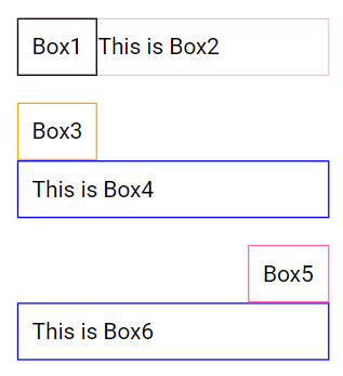
.box2hasclear: none;, which means it will be placed next to.box1..box4hasclear: left;, which ensures that it moves down past.box3and starts from a new line below the floated element..box6hasclear: right;, which ensures that it moves down past.box5and starts from a new line below the floated element.

The Clearfix Issue
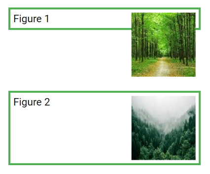
If a floated element is taller than its containing element, it may overflow and extend outside the container. To prevent this, we can assign a class .clearfix to the container element and use overflow: auto; on it.
.clearfix {
  overflow: auto;
}
In the above example, you can see in figure 1 that the floated image element is overflowing outside the container. Figure 2 shows the behavior where the .clearfix class is assigned to the container element, which solves the overflow issue.
Using overflow: auto; can effectively handle clearfix issues, provided you carefully manage your margins and padding to avoid unwanted scrollbars. However, the modern clearfix hack is generally safer and more versatile for most webpages.
.clearfix::after {
  content: "";
  clear: both;
  display: table;
}
This approach ensures that your container correctly wraps around floated elements without causing overflow issues or unwanted scrollbars, providing a more robust solution for modern web development.
Float - Navigation Menu Example
You can create a navigation menu by defining a ul element with multiple li elements, each having a link element and then using the float property on the li elements. You can add padding, background, border and color properties to the link elements to give the menu a nicer look, as shown below.
ul {
  list-style-type: none;
  margin: 0;
  padding: 0;
}
li {
  float: left;
}
li a {
  background-color:orangered;
  display: block;
  color: white;
  text-align: center;
  padding: 14px 16px;
  text-decoration: none;
}
li a:hover {
  background-color: #111;
}
Please check below options for the links to our previous or next tutorial.
